
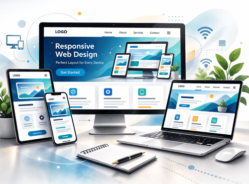
Business owners often ask which single upgrade delivers the biggest return on a website. The answer is rarely a flashy animation or clever headline. It is responsive web design. This essential design feature allows a website to adapt perfectly to phones, tablets, and desktops, helping visitors stay longer, interact more, and convert into customers.
Engagement rises because users feel comfortable. Text is readable, buttons are easy to tap, and pages load quickly regardless of device. When a site behaves this way, people explore instead of leaving in frustration. That simple experience can lift interaction rates by around fifty per cent compared with fixed, non-responsive layouts.
What Responsive Design Really Means
Responsive design is not a separate mobile site. It is one flexible website built with a core design feature that allows layouts, images, and navigation to adapt automatically to any screen size.
This approach avoids the old problem of maintaining two versions of a site. Updates happen once and appear everywhere, saving time and preventing mistakes.
Why Engagement Depends on Comfort
Most internet browsing now happens on phones. If a page forces visitors to pinch and zoom, they feel unwelcome. Studies show that people judge a business within seconds based on how easily they can read and navigate.
This behaviour reflects national trends. The Australian Bureau of Statistics reports that 91% of Australian households have internet access, with mobile devices playing a central role in how people browse and interact with websites. This makes responsive web design essential for keeping visitors engaged.
A responsive layout removes those tiny irritations. Users glide through information, which encourages them to click deeper, watch videos, or complete forms. Comfort directly translates into measurable engagement.
Search Engines Reward Responsiveness
Google and other search engines prioritise mobile-friendly pages. A responsive site often ranks higher because algorithms recognise it as useful for modern audiences. Better visibility brings more qualified traffic before any marketing spend occurs.
Developers who ignore responsiveness risk watching competitors overtake them simply by meeting this basic expectation.
Faster Pages, Happier Visitors
Responsive design encourages optimisation by delivering appropriate image sizes and removing unnecessary elements. This performance-focused design feature improves load speed and reduces abandonment.
Every extra second of delay pushes a portion of visitors away. Speed is not a luxury; it is part of the design itself.
Consistent Branding Across Devices
When layouts shift smoothly between screens, brand identity stays strong. Colours, fonts, and messages remain familiar whether someone visits from a laptop at work or a phone on the train.
Consistency builds trust. A business that looks professional everywhere feels reliable everywhere.
Lower Development Costs
Maintaining separate desktop and mobile sites doubles effort. Content must be updated twice, analytics split in two, and bugs appear in one version but not the other. Responsive design eliminates this duplication.
For developers, one codebase means cleaner maintenance and faster feature releases. For owners, it means lower bills and fewer headaches.
Better Conversion Paths
Forms and checkout processes benefit enormously from responsive thinking. Input fields enlarge for thumbs, calendars display clearly, and payment buttons remain obvious. These details reduce abandonment at the final hurdle.
A well-designed responsive form can be the difference between a casual visitor and a paying customer.
Real-World Examples
Retailers report higher average order values when shoppers can browse comfortably on phones. Service businesses see more appointment bookings after simplifying mobile navigation. Even non-profits receive more donations once pages adapt to small screens.
The pattern is consistent: remove friction, and engagement climbs.
Key Elements of a Strong Responsive Site
Successful responsive projects include essential design feature components:
- Fluid grids that scale proportionally

- Flexible images that never overflow
- Touch-friendly buttons and menus
- Readable text without zooming
- Simplified navigation on small screens
- Performance optimisation for mobile networks
These elements work together to create a seamless experience.
Designing for Thumbs, Not Cursors
Mobile users interact differently from desktop users. They tap rather than click and hold devices at varying angles. Responsive design respects these behaviours by providing generous touch targets and avoiding hover-only features.
Developers who test with real phones quickly notice how small adjustments improve usability.
Content Strategy Matters Too
Responsiveness is more than layout. The order of information should change to match mobile priorities. Important messages belong near the top, while secondary details can wait further down.
This rethinking often improves the desktop version as well, proving that mobile design benefits everyone.
Analytics Reveal the Truth
Most analytics dashboards show a clear split between mobile and desktop visitors. Sites without responsive design typically suffer high bounce rates on phones. After redesigns, those numbers fall dramatically while time on page increases.
Data removes guesswork and demonstrates the financial value of the upgrade.
Avoiding Common Mistakes
- Using fixed-width images that break on phones
- Hiding essential content on small screens
- Relying on tiny text for menus
- Forgetting to test across different browsers
- Overloading mobile pages with heavy scripts
Recognising these pitfalls keeps projects on track.
The Developer’s Perspective
For developers, responsive frameworks such as CSS grid and flexible breakpoints simplify complex challenges. Modern tools allow layouts to adapt elegantly without endless custom code.
Learning these techniques enhances employability and ensures future projects meet industry standards.
The Business Owner’s Perspective
Owners care about results rather than code. Responsive design delivers practical benefits:
- More enquiries from mobile users
- Higher search rankings
- Stronger brand credibility
- Reduced maintenance costs
- Happier customers
These advantages explain why responsiveness has become a baseline requirement rather than an optional extra.
Planning a Responsive Upgrade
Start by reviewing current analytics to understand device usage. Identify pages with high mobile bounce rates and redesign them first. Test prototypes with real customers and gather feedback before full rollout.
Even small improvements, such as larger buttons or simplified menus, can produce quick wins.
Future-Proofing the Website
New devices appear every year—folding phones, tablets of unusual sizes, and large desktop monitors. Responsive design prepares a site for this unpredictable future. Instead of chasing each gadget individually, the layout adapts naturally.
This flexibility protects investment for years to come.
Engagement Starts with Respect
At its heart, responsive design is about respecting the user’s situation. Whether someone visits during a lunch break on a phone or from a wide office monitor, the experience should feel equally welcoming. When visitors feel respected, they stay longer and engage more deeply.
That respect is the true reason engagement can rise by fifty per cent or more.
Ready to make your website work beautifully on every screen?
Talk to GC Websites for responsive design solutions that boost engagement and deliver real business results.
1. What is responsive web design?
Responsive web design is a website development approach that allows layouts, images, and content to automatically adapt to different screen sizes, including phones, tablets, and desktops, using a single flexible codebase.
2. Why does responsive design increase website engagement?
Responsive design improves readability, navigation, and load speed across devices. When users can easily interact with a site without zooming or struggling with layout issues, they stay longer and are more likely to convert.
3. Does responsive design improve SEO rankings?
Yes. Search engines prioritise mobile-friendly websites in search results. A responsive design improves usability on mobile devices, which can positively influence rankings and increase organic traffic.
4. Is it better to have a separate mobile site or a responsive website?
A responsive website is generally better because it uses one codebase that adapts to all devices. This reduces maintenance costs, prevents duplicate content issues, and ensures consistent branding.
5. How can I tell if my website needs a responsive upgrade?
If mobile visitors have high bounce rates, struggle with small text or buttons, or if pages require zooming and horizontal scrolling, your site likely needs a responsive redesign.