
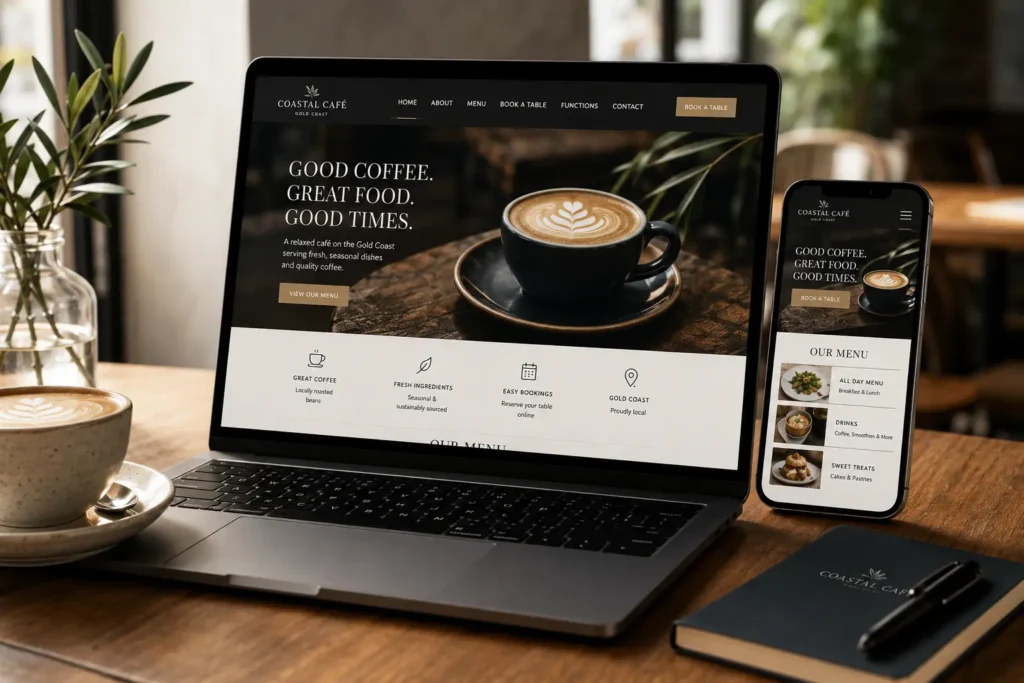
Someone searches for somewhere to eat.
They may be ten minutes away. They may already have coffee in mind, be looking for lunch with friends or be trying to find somewhere suitable for dinner that night.
They open your website.
At that point, your café or restaurant has a practical job to do online. Show them what you serve. Tell them where you are. Confirm that you are open. Give them an easy way to book, order or get directions if that is what they need.
The visual experience still counts. Hospitality is emotional and sensory. People want some feeling for the venue before they arrive.
We design hospitality websites so the atmosphere and the useful information work together.
For café website design on the Gold Coast, that balance can make the difference between a website somebody admires and one they can actually use.
Customers May Choose a Venue Before They Leave Home
Hospitality decisions can happen quickly.
A customer searches. A few nearby venues appear. They open several websites and start comparing.
They are rarely conducting an exhaustive investigation into each business. They want enough information to make a comfortable choice.
That puts menus, trading hours, location details and booking information near the centre of the experience.
A striking homepage cannot compensate for making people search three pages deep to find out whether you serve breakfast.
Answer the Important Questions Quickly
A visitor to a café or restaurant website will often want answers to a familiar set of questions.
What is on the menu? What time do you open? Where exactly are you? Do you accept bookings? Can I order online? Is there a phone number if I need to ask something?
Those answers should feel close at hand.
We prefer to build the website around that behaviour rather than assume visitors will patiently explore every page.
The experience can still have personality. It should. A café, bar or restaurant without personality is missing one of its strongest assets.
The useful information simply needs to remain easy to reach.
On Mobile, Every Extra Search Creates Friction
Hospitality websites deserve to be designed around mobile use from the beginning.
A person may be walking through Bundall, Broadbeach, Burleigh or another part of the Gold Coast while searching for somewhere nearby. They may be checking the menu from a passenger seat or trying to make a booking while organising a group chat.
That is a different environment from browsing leisurely on a desktop computer.
Australian internet behaviour reinforces the importance of that mobile experience. According to the Australian Communications and Media Authority, 97% of Australian adults used a mobile phone to access the internet in 2025. For cafés and restaurants, that makes mobile-friendly menus, location details and booking pathways particularly important when customers are deciding where to go.
Buttons need to be easy to use. Menus need to be readable. Contact details need to be visible. Pages should not force people to zoom, rotate their phone or hunt through complicated navigation.
Responsive design forms part of our WordPress approach because the website needs to work where customers are actually using it.
Make the Menu Easy to Find Before You Make It Beautiful
A hospitality website can have beautiful photography and still fail one of the most basic customer tests.
Finding the menu.
Menus are often among the highest-interest pieces of content on a café or restaurant website. They tell customers about the food, pricing, dietary options, drinks and overall style of the venue.
We want that information to be easy to access.
Customers Should Not Have to Hunt for Food and Drink
A menu link hidden at the bottom of a navigation dropdown asks too much from somebody who has arrived specifically to see what you serve.
The path should be obvious.
Depending on the venue, that might mean a clear menu button in the main navigation, a homepage section introducing the menu or direct links to breakfast, lunch, dinner and drinks.
The structure should reflect how the business operates.
A neighbourhood café with one compact menu may need very little complexity. A restaurant with separate lunch, dinner, functions and drinks menus may benefit from a more structured approach.
The objective stays the same: help customers reach the information they came for.
Avoid the Menu PDF Trap When It Creates a Poor Mobile Experience
PDF menus are common in hospitality because they can be easy for staff to upload.
They can also be awkward for customers.
A menu designed for an A4 page may open as tiny text on a phone. Customers pinch and zoom, slide around the page and try to keep track of which section they are reading.
There are situations where a PDF is perfectly workable, particularly when it is properly formatted and maintained.
In other cases, putting menu information directly onto the website gives us more control over mobile presentation and can make updates easier to manage.
The right format depends on the menu, how frequently it changes and how customers need to use it.
What we want to avoid is a menu that looks polished in its original artwork but becomes hard work on the device most customers have in their hand.
Trading Hours and Location Details Should Never Be a Treasure Hunt
A customer can love the menu and still abandon the visit if they cannot confidently work out whether the venue is open.
Trading hours and location details may not be glamorous content, but they answer questions tied directly to a real visit.
We give them the space they deserve.
Put the Details People Need Where They Naturally Look
Opening hours usually belong in more than one useful place.
A customer may look in the footer, contact page, homepage or a dedicated location section. The website structure should account for those habits without repeating the same information everywhere.
Address details deserve the same treatment.
If access, parking or another location detail regularly causes confusion, the website can explain it before the customer sets off.
Special trading periods deserve attention too. Christmas, Easter and public holiday hours can change customer expectations quickly, so hospitality businesses need a sensible way to keep that information current.
A customer who arrives at a venue after reading incorrect opening hours is unlikely to see the website as helpful.
Maps and Directions Can Turn Local Search Into a Visit
For a local hospitality business, the website exists partly in the physical world.
The customer ultimately needs to reach the venue.
Embedding or linking to useful mapping information can help someone move from browsing to directions without another search.
The location should also be written clearly enough that customers can recognise the suburb or area immediately.
For Gold Coast hospitality businesses, local context can be useful because customers may be comparing venues across several nearby suburbs rather than searching for one specific restaurant by name.
A good hospitality website closes the distance between finding the business online and finding the front door.
Make Booking the Natural Next Step
A booking button is valuable when booking is genuinely part of the customer journey.
Its usefulness also depends on where it appears.
Someone who has just viewed the menu, checked the location and decided the venue suits them is in a very different position from someone who has only just landed on the homepage.
We design booking pathways around those moments of intent.
Put Booking Actions Where Decisions Happen
Booking does not need to dominate every part of a website.
It does need to be easy to find once somebody wants it.
That could mean a persistent navigation button, a booking action near venue information or a clear next step after menu content.
Restaurants with a strong reservation model may justify more prominent booking access. A casual café that operates mainly through walk-ins may need something different.
We would rather reflect the business accurately than add a booking feature simply because restaurant websites are expected to have one.
Match the Website Journey to the Real Booking Process
Hospitality businesses operate in different ways.
Some use direct bookings. Others use external reservation platforms. Some rely largely on phone enquiries, while cafés may focus on walk-ins and takeaway orders instead.
The website should support the process customers will actually encounter.
That may involve integrating a booking platform, directing visitors to a third-party system or making a telephone action easy on mobile.
The technical solution follows the customer journey.
The software comes afterwards.
Your Website Should Reflect the Venue Experience
Hospitality gives web design something other industries do not always have in the same abundance.
Atmosphere.
The fit-out, food, coffee, lighting, typography, plating, staff, signage and surrounding location all contribute to the character of a venue.
The website can begin telling that story before someone arrives.
Hospitality Branding Should Reflect the Venue
A photograph of a table in late-afternoon light can communicate something a paragraph struggles to capture.
So can an image of a busy breakfast service, a beautifully made dish or a simple cup of coffee against recognisable branding.
Good hospitality design gives those visual assets room to work.
We think about how typography, spacing, colour and photography combine to set an expectation. A relaxed neighbourhood café should not necessarily feel like a fine-dining restaurant online. A highly polished restaurant should not look like a generic takeaway directory.
The design should feel connected to the venue.
We shape each website around the business, audience and content rather than forcing every hospitality client into the same visual style.
Strong Visual Branding Still Needs Practical Navigation
Atmosphere should never hide the menu.
A dramatic full-screen image may establish the character of a venue beautifully, but the customer still needs somewhere obvious to go next.
We balance visual storytelling with practical navigation so people can enjoy the brand and use the site without those goals competing.
That principle becomes especially useful on mobile, where screen space is limited.
A great photograph can stay. A confusing animation, oversized introduction or decorative interaction that blocks useful information deserves harder scrutiny.
Hospitality design is strongest when the experience feels natural to the customer.
Online Ordering and Catering Need Their Own Clear Path
A hospitality website may serve several types of customer at once.
One person wants a table. Another wants takeaway. Someone else is organising catering for an office event.
If all three are forced through the same generic contact route, the website loses an opportunity to make each journey simpler.
Different Customer Intentions Should Not Compete for the Same Button
We like to separate actions when the distinction helps the customer.
“View Menu”, “Book a Table”, “Order Online” and “Catering Enquiries” each describe a different intention.
That does not mean filling every screen with buttons.
It means giving people the right action at the right point.
A catering customer may need different information from someone deciding where to have lunch. A dedicated catering section can explain the offering and lead into an enquiry without cluttering the everyday dining experience.
WooCommerce Can Support Hospitality Businesses Selling Online
Some hospitality businesses need more than enquiry forms.
Products, vouchers, catering items or other online purchases may suit an eCommerce setup.
We specialise in WordPress and use WooCommerce for eCommerce website development, giving us a way to combine online selling with the broader website instead of treating the shop as a completely separate digital experience.
Whether WooCommerce is appropriate depends on what the venue needs to sell and how the operation works behind the scenes.
We determine that from the requirement first.
The software comes afterwards.
A Café Website Should Be Easy for Staff to Keep Current Too
Customers see the front of the website.
The business has to live with the back of it.
That matters in hospitality because information can change frequently. Menus evolve. Prices change. Seasonal items arrive. Trading hours shift. Events and promotions come and go.
A website that requires a developer for every small text edit can create unnecessary friction for the venue.
WordPress Gives Venues a Practical Way to Update Everyday Content
WordPress is our core website platform, and our current development approach uses tools such as Elementor to give clients more accessible control over everyday content.
The precise editing setup depends on the site we build.
For many hospitality businesses, the aim is to make common updates manageable while protecting the broader design and functionality from accidental changes.
We also provide hosting and ongoing website support for businesses that would rather have help maintaining the technical side.
An Outdated Menu Can Undermine an Otherwise Excellent Website
The most beautifully designed restaurant website still creates a poor experience if the menu is six months out of date.
The same applies to trading hours, phone numbers or booking instructions.
Customers use this information to make real decisions.
Content maintenance therefore belongs in the website conversation from the start.
We want to know who will update it, how frequently it changes and which areas need to be easy for the venue to manage.
Designing around those operational details can save frustration later.
What We Would Check First on a Gold Coast Café or Restaurant Website
Before changing colours or discussing a new visual direction, we would look at how the current website handles the customer journey.
These six areas usually tell us a lot:
| Area | What we would check |
| Menu accessibility | Can somebody find the food and drink information quickly and comfortably read it on a phone? |
| Trading hours | Are current opening times easy to locate without searching multiple pages? |
| Mobile usability | Can customers use the main navigation, menu, location and contact functions comfortably on a smaller screen? |
| Location clarity | Is the address obvious, and can someone move easily from the website to directions? |
| Booking or ordering pathway | Once a visitor decides to act, is the appropriate next step easy to find? |
| Visual alignment | Does the site feel like the venue customers are about to visit? |
Those questions give us a practical picture of what the website needs before we start discussing aesthetics.
Sometimes the design needs a complete rethink. Sometimes the largest usability gains come from fixing the structure around otherwise strong brand assets.
The answer depends on the site in front of us.
See How We Design Websites Around Real Businesses
A hospitality website should feel specific to its venue.
That means our portfolio is most useful when you look at the range rather than search for an existing website to duplicate.
Browse our web design portfolio and look at how we approach different businesses, audiences and content requirements.
Pay attention to how each project presents its brand, how information is organised and how the design leads visitors towards useful actions.
Your café or restaurant should still look like yours.
The portfolio simply shows you how we think.
Is Your Website Helping Customers Choose Your Venue?
A person searching for somewhere to eat may already be close to becoming a customer.
They need the right information in the right order.
A readable menu. Accurate trading hours. A clear location. An easy booking or ordering path if your venue offers one. Enough visual character to give them a feel for the place.
Those pieces create a website that supports the customer decision instead of slowing it down.
If your current hospitality website feels dated, awkward on mobile or harder to use than the venue itself, contact our Gold Coast web design team.
Send us the current website and tell us how customers normally interact with your café, restaurant or venue.
We can start there.
Questions Worth Answering Before You Redesign a Hospitality Website
What should a café website include?
A café website should make the information customers commonly need easy to reach.
That usually includes the menu, location, trading hours, contact details and a clear next action such as getting directions, ordering or making an enquiry.
Additional sections should reflect how the venue actually operates.
Should a café menu be a PDF or a normal webpage?
Either format can work, but the decision should account for mobile readability and how often the menu changes.
A properly designed PDF can be suitable for some venues, while an HTML menu can provide more control over responsive presentation and editing.
We choose the format around the actual menu and maintenance requirements.
Does a restaurant website need online bookings?
No.
A restaurant website should reflect the real booking process. If reservations are central to the business, a prominent online booking path can be useful.
A café that primarily operates through walk-ins may gain more from easy directions, phone access or online ordering.
Can a hospitality website integrate online ordering?
Yes, depending on the ordering system and the requirements of the venue.
WordPress can support different eCommerce and integration approaches, and WooCommerce is part of our eCommerce development stack where it suits the project.
We determine the appropriate setup from the operational requirements rather than assume the same platform suits every venue.
Can a café website help with local SEO on the Gold Coast?
A well-structured website can provide a stronger foundation for local search by clearly describing the business, offering and location.
Accurate business information and useful locally relevant content can also help search engines understand the site.
Rankings depend on many factors, so we do not treat the website alone as a guarantee of visibility.