
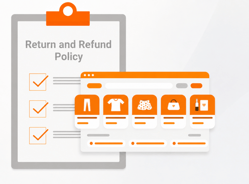
Most brand owners do not lose sales because their return policy visibility is terrible. They lose sales because buyers cannot find it fast enough to feel safe.
We see this all the time on ecommerce sites. The product looks good, the pricing is reasonable, the photography is strong, and the checkout works. Then the buyer hits a quiet moment of doubt. What if it does not fit. What if it arrives and feels different in person. What if returning it turns into a drawn-out support thread. If the answer is buried in the footer, hidden in legal copy, or scattered across three separate pages, that doubt starts doing damage.
Return policy visibility is not a minor UX detail. It shapes trust at the point where money is about to move. When buyers can find the answer quickly, they keep going. When they cannot, they pause, compare, or leave.
The sale often slips before the cart is abandoned
A lot of conversion loss happens before a shopper ever clicks away. They are still on the page. Still reading. Still interested. But confidence has started to leak.
What shoppers are really looking for before they buy
Most buyers are not reading your full returns page from top to bottom. They are scanning for a few practical answers. Can I send it back. How long do I have. Who pays for shipping. Are there exclusions. How hard is the process.
That is not paranoia. It is risk management.
This becomes even more obvious on first-time purchases, apparel, footwear, gifts, personal care, homewares, custom products, and higher-value orders. In each of those cases, the buyer is trying to reduce uncertainty before committing. Your return policy becomes part of the product experience, even though it sits outside the product itself.
Why uncertainty spreads faster than most owners expect
Uncertainty rarely stays in one place. A buyer who cannot find clear return information does not just question the return process. They start questioning the whole operation.
They may wonder whether support is responsive. Whether delivery times are reliable. Whether product descriptions are accurate. Whether the business will be easy to deal with after payment clears. That chain reaction is why a hidden policy can weaken performance across the funnel, not just at the policy page.
Return policy visibility is a conversion issue, not a footer item
Many sites technically have a returns page. That is not the same as making it visible.
A footer link satisfies compliance. It does not always satisfy buyer behaviour. The issue is wider than presentation. In 2025, the ACCC conducted a sweep of more than 2,000 Australian retail websites and found some businesses using return policies and website terms and conditions that may contravene the Australian Consumer Law. The review raised concerns about policies that could mislead consumers about their rights to refunds, exchanges, and returns.
That makes return policy visibility both a trust issue and a compliance issue. If the policy is hard to find, unclear, or written in a way that creates doubt, it can weaken buyer confidence before the customer reaches checkout.
The commercial cost of making buyers hunt for reassurance
When reassurance is hard to find, shoppers hesitate at the exact point where you need momentum. That hesitation can lead to abandoned sessions, lower conversion rates, slower decision-making, and a heavier support load from questions that should have been answered on-page.
It can also make discounting feel more necessary than it really is. If the site feels risky, price becomes the easiest lever to pull. Brands end up giving margin away to compensate for friction that could have been reduced with clearer trust signals.
Where hidden policies quietly damage margin
The cost is not always dramatic enough to spot in one report. It often shows up in smaller leaks.
You may see more pre-purchase support emails asking basic return questions. You may see product pages with healthy traffic but weaker conversion than expected. You may see checkout drop-off that looks pricing-related, even though the actual issue is uncertainty. You may also see repeat purchase behaviour soften because the first order felt harder to evaluate than it should have.
That is why return policy visibility deserves attention from the same people looking at CRO, customer experience, and retention.
The page is not the problem the placement usually is
A well-written return policy page still underperforms if shoppers only encounter it after they start searching for it. By that stage, you are asking them to do extra work during a high-friction moment.
The product page
For most brands, the product page is where return information starts earning its keep. This is where shoppers compare risk against desire.
A short, clear returns message near the add-to-cart area can reduce hesitation before it grows. The same applies near sizing tools, shipping information, or product option selectors. Buyers should not have to scroll into a legal section or open a hidden menu to answer a basic trust question.
This does not mean cramming the page with policy text. It means surfacing the right line, at the right moment, with a path to fuller detail.
The cart and checkout
Cart and checkout are late-stage confidence checks. A shopper who proceeds this far still may not be fully settled. They are doing a final scan for reasons to stop.
Visible return information here can steady the decision. A short summary, a linked policy, or a simple reassurance block often works better than assuming the buyer has already found everything they need. The goal is not to sell harder. The goal is to remove the last remaining uncertainty.
Site-wide trust zones
Return information also belongs in the parts of the site buyers use when they want certainty without friction. That may include FAQ pages, shipping pages, help sections, mobile product accordions, and customer service hubs.
What you want is consistency. The same answer should show up in the same language across the site. Not one version on the product page, another on the policy page, and a half-explained variation inside checkout.
What strong return policy visibility looks like in practice
The best-performing approach is usually not the longest or the most generous. It is the clearest.
Clear before generous
A vague promise like “easy returns” sounds helpful, but it does not answer anything. Buyers are trying to picture the process. They want to know what happens next, not just whether the headline sounds friendly.
Clear policy language reduces mental effort. It tells the shopper what they can expect, where the boundaries are, and how the process begins. That reduces uncertainty before the order and reduces disputes after it.
The details buyers actually want
Most shoppers are looking for a short set of practical points:
- the return window
- product condition requirements
- exclusions or non-returnable items
- whether exchanges are available
- when refunds are processed
- who covers return shipping
- how to start the return
If those details are present, easy to scan, and written in plain English, the policy starts doing its job. If they are hidden in dense paragraphs or padded with legal phrasing, the buyer has to work too hard.
How to stay reassuring without sounding defensive
Tone changes how policy content lands. A defensive tone can make a brand sound difficult before anything has gone wrong. A loose tone can create ambiguity that leads to support friction later.
An honest tone works best for most ecommerce brands. Say what the buyer needs to know. Be direct about exclusions. Be clear about process. Keep the language calm. Trust grows when the policy feels transparent, not polished beyond recognition.
Common return policy visibility mistakes that make a decent policy underperform
A lot of return policies fail in execution rather than substance.
Burying the link in the footer
A footer link is useful, but it should not be the only access point. Buyers often look for return reassurance while they are still evaluating the product, not after they have decided to inspect the site structure.
If the only route to the answer sits at the bottom of every page in a low-attention area, visibility is weak even though the page technically exists.
Using policy language no normal buyer would read
Some brands write return policies as though they are trying to win an argument before one happens. That usually creates distance.
Legal review has its place, but buyer-facing content still needs clarity. If ordinary customers cannot understand the conditions quickly, the policy starts generating hesitation instead of confidence.
Forcing buyers to piece the answer together across multiple pages
One page explains refunds. Another explains exchanges. A third explains shipping. The FAQ covers part of it. The checkout hint says something slightly different.
That setup increases cognitive load. Buyers end up doing detective work. When trust depends on multiple pages lining up, small inconsistencies start causing outsized problems.
A practical audit brand owners can run this week
You do not need a full redesign to improve return policy visibility. In many cases, the first lift comes from placement and clarity.
Five checks to see whether your return policy is helping or hurting
First, look at your top product pages and ask whether a new visitor can see return reassurance without searching for it.
Second, check whether the policy language is written in plain English or wrapped in legal-heavy phrasing.
Third, test the mobile experience. This is where buried accordions, tiny links, and collapsed trust content often create friction.
Fourth, compare product-page messaging, FAQ wording, checkout references, and the full policy page. If they do not match, fix the mismatch.
Fifth, review support questions. If customers repeatedly ask about return windows, refund timing, or process steps, the site is not answering those questions clearly enough.
What to fix first if you want the fastest lift
Start with the product page. This is where the largest share of buyer hesitation can be reduced.
Then tighten the policy copy itself. Remove vague claims, simplify the language, and bring the buyer-facing details higher on the page.
After that, reinforce return information in cart and checkout. Those touchpoints are often overlooked, even though they can steady a decision that is close to converting.
What changes after buyers can find the answer fast
When return information is visible and clear, the whole buying experience starts feeling more stable.
Shoppers spend less time second-guessing. Support teams spend less time answering predictable questions. Product pages carry less hidden friction. Expectations improve before the order is placed, which often leads to fewer avoidable complaints after delivery.
Not every brand will see the same pattern, and return visibility alone will not fix deeper issues like weak offers, poor product-market fit, or slow delivery. But when the product is already competitive, this is one of those quiet improvements that can unlock cleaner performance without changing the offer itself.
The brands that win trust make decisions easier
Brand owners often put serious effort into traffic, creative, product merchandising, and paid acquisition, then leave trust content sitting in the background. That is where money slips away.
A visible return policy helps buyers make a decision with less doubt. It supports trust before purchase, not just after a problem. When it is placed well, written clearly, and repeated in the right places, it becomes part of the sales process in the best possible way.
If you are reviewing why shoppers hesitate on product pages or abandon near checkout, this is one of the first places we would inspect. Sometimes the fix is not a major rebuild. Sometimes it is making the answer easier to find.
At GC Website, we help ecommerce brands improve the pages, trust signals, and website content that influence buyer confidence. If your return policy, product pages, or checkout experience need clearer messaging, contact us to discuss how we can help improve your website’s performance.
The questions brand owners ask once they realise the policy is being ignored
How visible should a return policy be on an ecommerce site?
It should be easy to find from any product page and visible again near cart or checkout. Buyers should not need to hunt through the footer or open multiple support pages just to understand the risk of ordering. Good visibility reduces effort at the exact moment trust is being tested.
Should return information appear on every product page or only on the main policy page?
The main policy page should hold the full detail, but product pages should still surface a short version or a clear summary. That gives shoppers immediate reassurance without forcing them to leave the buying flow. A linked detail view can then handle conditions and exceptions.
Can a more visible return policy increase conversions even if the policy itself does not change?
Yes, because visibility changes how quickly a buyer can resolve uncertainty. The offer stays the same, but the path to confidence becomes shorter. In many cases, that is enough to reduce hesitation and support a cleaner purchase decision.
What return policy details reduce hesitation before purchase?
Buyers usually want to know the return window, refund timing, item condition rules, exclusions, return shipping responsibility, and how to start the process. Those details remove guesswork. When they are missing or vague, shoppers tend to assume the process will be harder than it really is.
Is there a risk that making returns more visible increases return rates?
That can happen in some categories, but poor visibility creates its own cost through distrust, abandoned carts, and misaligned expectations. Clear policies tend to attract better-informed purchases, which often improves order quality rather than simply encouraging more returns.
What is the best place to show return information during checkout?
Show it close to order review, payment steps, or cart summary areas where buyers do final risk checks. Keep it short and plain. The goal is to reassure, not overwhelm the checkout with policy text.
How can I make the policy clearer without creating legal risk?
Separate customer-facing clarity from formal legal structure. You can keep the policy accurate and reviewed while still rewriting headings, summaries, and key points in plain language. In practice, that usually means clearer labels, shorter sentences, and direct explanations of what customers can actually expect.